All work

Hospitality web · Trout Creek Resort

Status: Shipped client work

A resort website,
built from the ground up.

From a blank starting point to a complete place to explore the resort, compare accommodations, plan a Northern Michigan trip, and reach reservations.

Visit troutcreek.com
Client
Trout Creek Condominium Resort
My role
Sole designer & developer
Product
Hospitality / consumer web
Scope
Information architecture, visual design & website build
Evidence
Actual live website captures
Current live-site design, captured November 6, 2026. Website design and build by Brian Williams; resort imagery and brand belong to Trout Creek.

THE PROJECT

Make the resort feel inviting.
Make the stay easier to choose.

I created the Trout Creek website from the ground up, connecting information structure, page design, and implementation. The experience needed to support both the emotional side of a getaway and the practical work of deciding where to stay.

The live pages show how those needs meet: a recognizable brand, property photography, comparable accommodation details, resort amenities, local activities, and a route into reservations.

This case uses captures of the actual website. The page-by-page breakdown describes what the live design demonstrates; it does not present reconstructed screens or invented research findings.

01 / INFORMATION ARCHITECTURE

One destination. Several reasons to visit.

The structure supports different starting points while keeping the accommodation decision close. A family comparing room sizes and a visitor planning seasonal activities can enter through different pages.

  1. 01

    Picture the trip

    Homepage and destination content

  2. 02

    Compare the stay

    Accommodation sizes and capacity

  3. 03

    Inspect a condo

    Unit details, features and imagery

  4. 04

    Take the next step

    Reservation link or direct contact

02 / THE LIVE PAGE DESIGNS

Different page jobs.
A consistent place to stay.

Six views of the real website show the relationship between brand, content hierarchy, and the visitor’s next action. Open any capture to inspect it at a larger size.

LIVE WEBSITE / NOVEMBER 6, 2026View source page

01 / HOMEPAGE

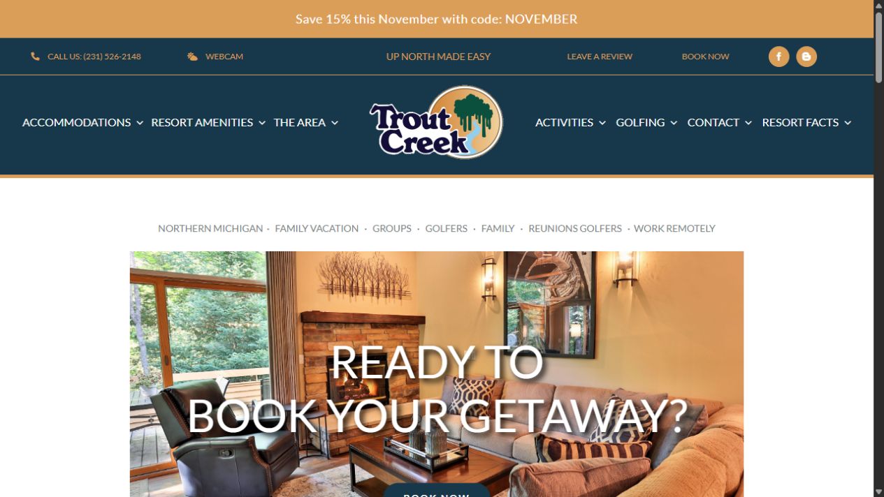
A welcoming first impression

The homepage brings the resort’s identity and the stay itself together. A centered logo anchors the navigation, while the large photographic opening makes the property feel tangible before the visitor moves into practical information.

  • The shared header connects accommodations, the resort, local information, and activities.
  • Gold accents and deep blue establish a recognizable visual thread across page types.
  • A visible reservation route accompanies the destination storytelling.
LIVE WEBSITE / NOVEMBER 6, 2026View source page

02 / ACCOMMODATION COMPARISON

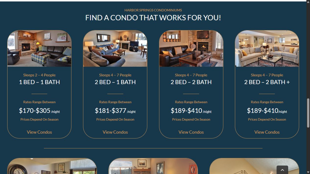
Compare the stay, not just the picture

The accommodation overview puts the same decision-making information in the same place on every card. A guest can compare sleeping capacity, room configuration, and the displayed seasonal range before opening a specific category.

  • Repeated card anatomy makes differences easier to scan.
  • Photography gives context; capacity and configuration support the practical choice.
  • The next action leads into the matching condo category.
LIVE WEBSITE / NOVEMBER 6, 2026View source page

03 / CONDO DETAIL

Give each property a useful, familiar structure

Within a room category, each condo follows a repeatable detail pattern: a named unit, location context, practical features, imagery or a tour, and a reservation action. The template carries the structure while the property information changes.

  • Unit identity and building context help distinguish similar options.
  • Grouped feature lists keep useful details close to the image.
  • The website hands the reservation step to the linked booking service.
LIVE WEBSITE / NOVEMBER 6, 2026View source page

04 / RESORT AMENITIES

Make the whole resort part of the decision

A stay is more than a room. The amenities page pairs descriptive content with generous photography, giving each facility its own readable section. The rounded image treatment and two-color headings connect this editorial layout to the accommodation pages.

  • Distinct sections give each facility room for context and useful details.
  • Image-and-copy pairs support browsing without flattening everything into a list.
  • Shared color, rules, and image corners hold the different layouts together.
LIVE WEBSITE / NOVEMBER 6, 2026View source page

05 / SEASONAL CONTENT

Help people picture the trip around the stay

Seasonal pages extend the experience beyond the property. A landscape opening establishes the setting, and the page groups relevant activities into a planning route. It gives destination content a role alongside accommodation discovery.

  • Seasonal photography introduces the topic before the detailed content.
  • Breadcrumbs retain context within the wider information structure.
  • Related activities offer a way to continue planning the trip.
LIVE WEBSITE / NOVEMBER 6, 2026View source page

06 / CONTACT & NEWSLETTER

Separate getting help from staying in touch

The contact page serves two different needs. Practical contact details occupy a dedicated column, while newsletter sign-up has its own space and explanation. A photographic strip keeps the page connected to the destination.

  • The two-column layout distinguishes immediate help from future updates.
  • Visible field labels make the form’s information requirements explicit.
  • Direct contact options remain available alongside the online reservation route.

03 / RESPONSIVE DESIGN

Keep the comparison useful
when the grid becomes a column.

The accommodation cards retain the same sequence on a phone: image, capacity, configuration, rate context, and the next action. The layout changes without asking the guest to learn a new comparison model.

1280px desktop capture · Actual live page · Open to inspect

04 / END-TO-END OWNERSHIP

The structure and the finish
were part of the same job.

Information architecture

Connecting accommodations, resort information, local activities, and visitor support into a navigable website.

Visual & interaction design

Page hierarchy, photography-led layouts, repeated accommodation patterns, navigation, and clear next actions.

Responsive implementation

Turning the design into a real website with page layouts that adapt across desktop and phone screens.

A connected visitor experience

Carrying the visitor from inspiration into property details and the linked reservation service, with direct contact available.

The live reservation links currently lead to an external booking provider. This case describes the website and its handoff into reservations, without claiming authorship of that provider’s booking platform.

05 / DELIVERED

A complete website,
with the real work on show.

The outcome is the built Trout Creek website: a shared identity across different page types, a structured accommodation journey, and supporting content that helps visitors plan a stay. The live-site captures make the work inspectable.

Traffic, conversion, and booking-lift measurements have not been supplied, so this case makes no numerical performance claim. These captures document the website’s current appearance rather than a historical before-and-after comparison.

Explore Trout Creek

Website screenshot